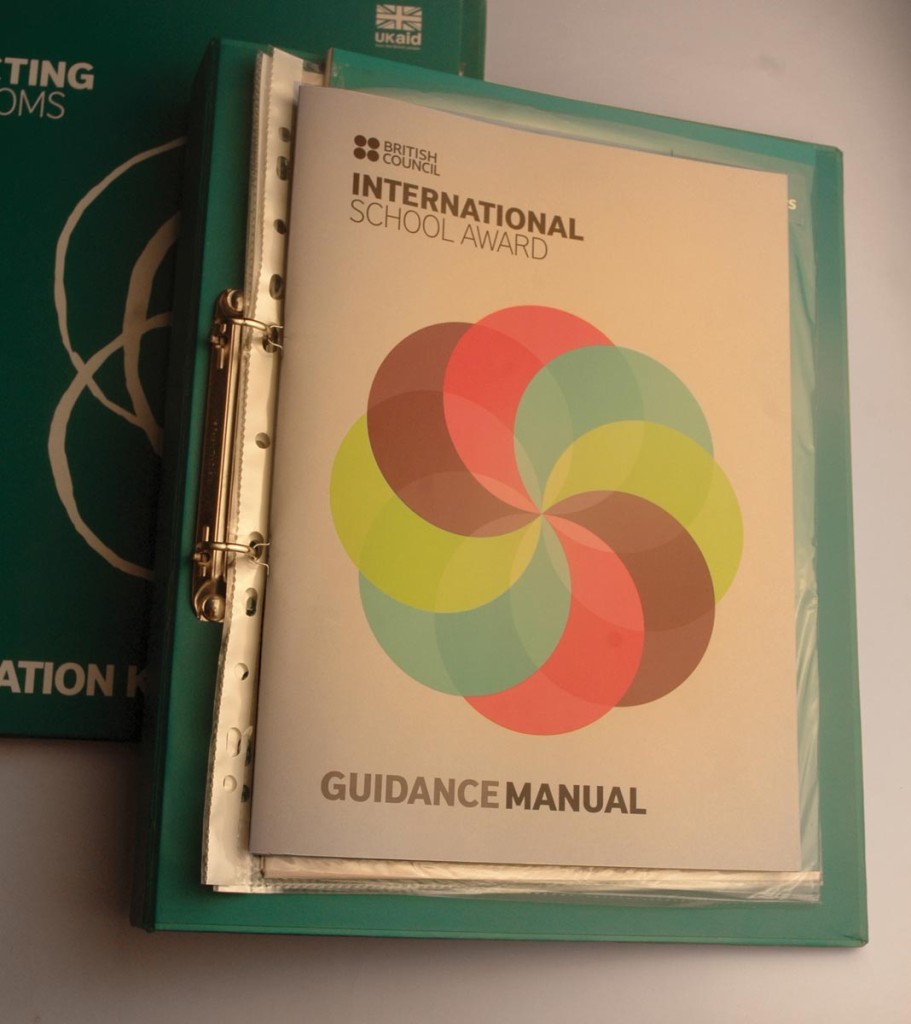
British Council
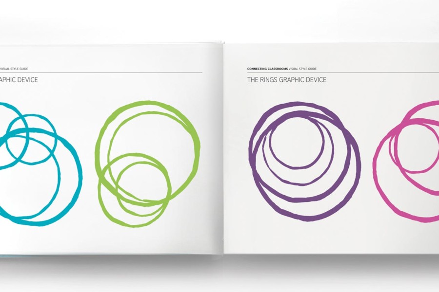
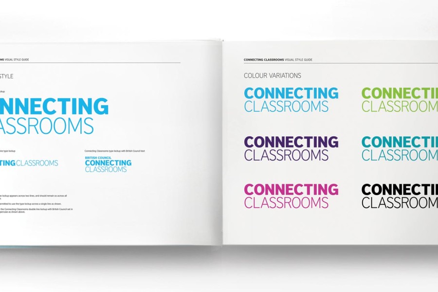
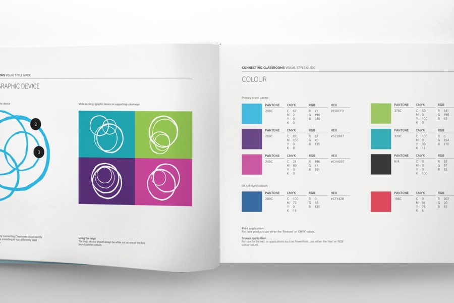
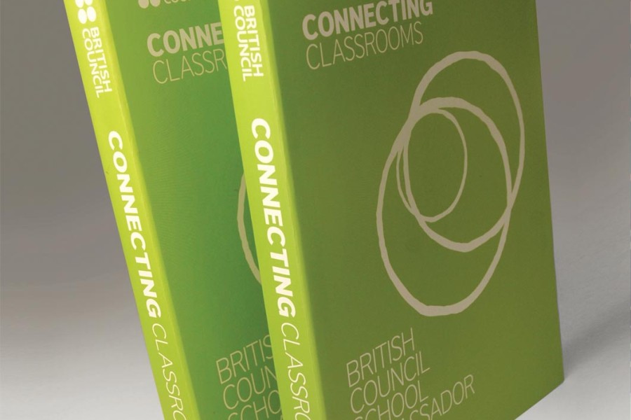
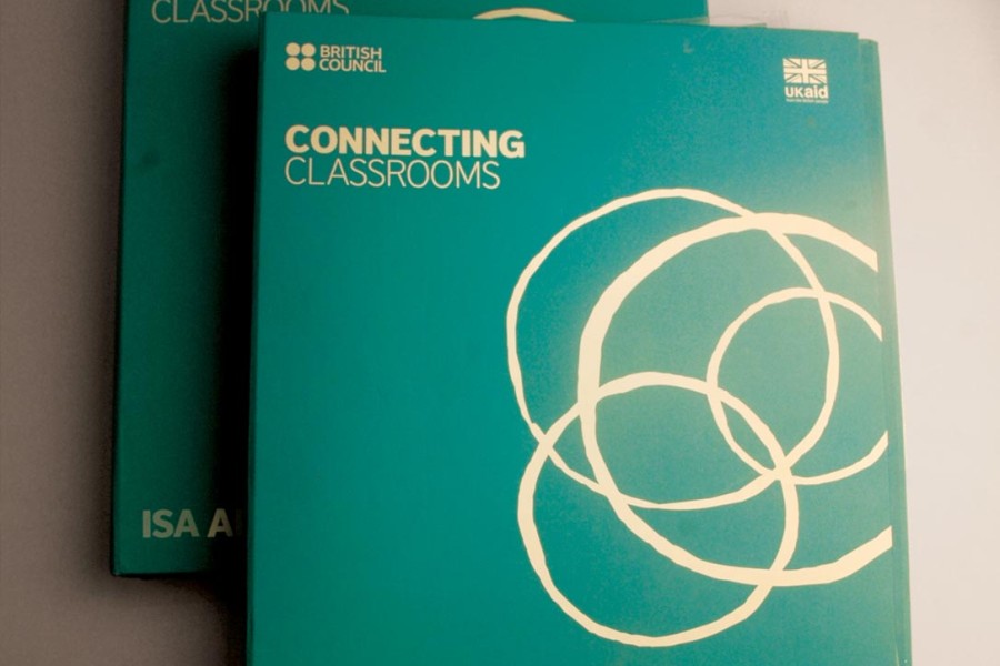
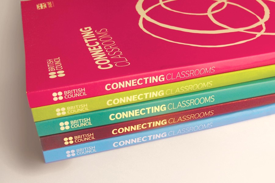
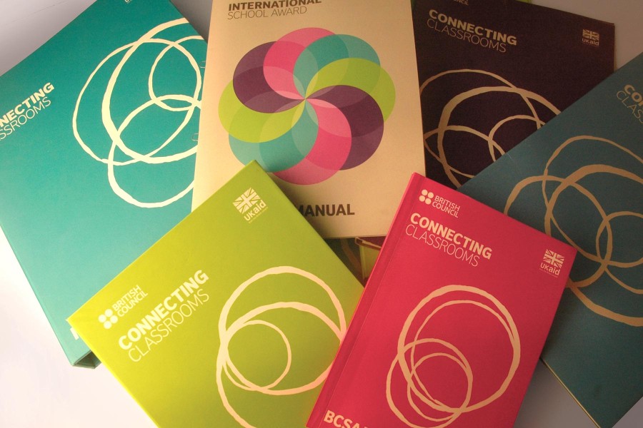
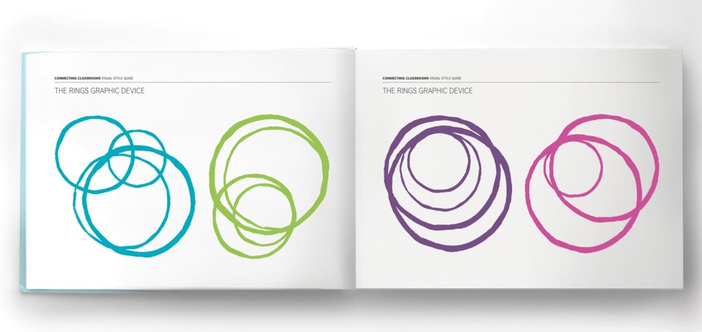
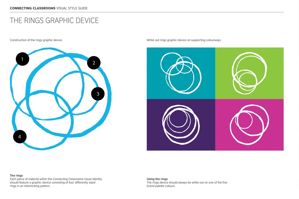
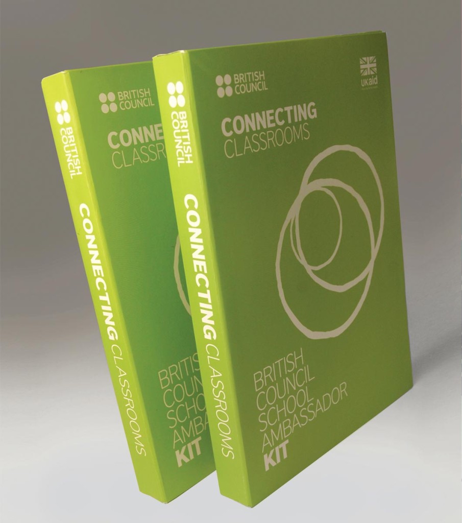
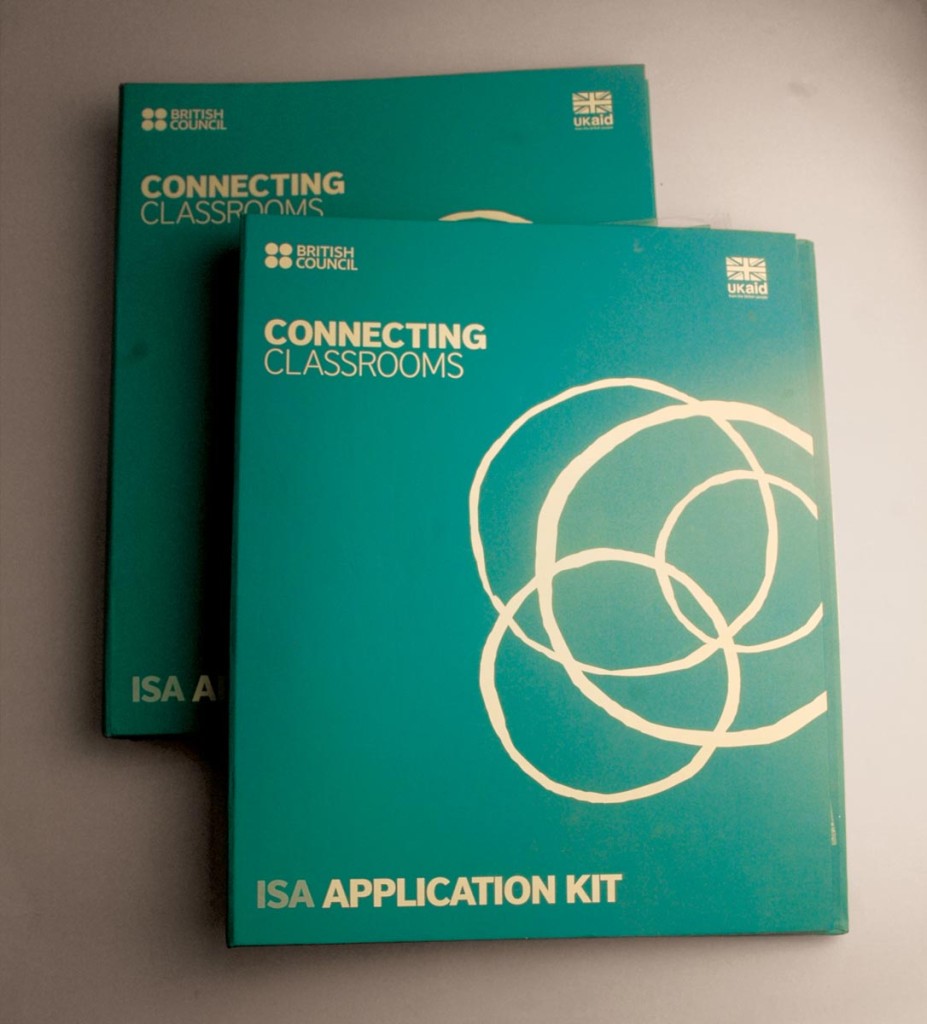
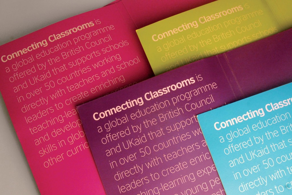
The design uses four interlocking ring devices for four different regions and uses four bright colors and clear typography to create a stark and distinct branding programme
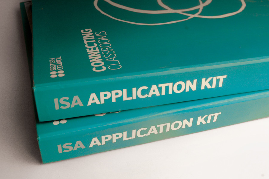
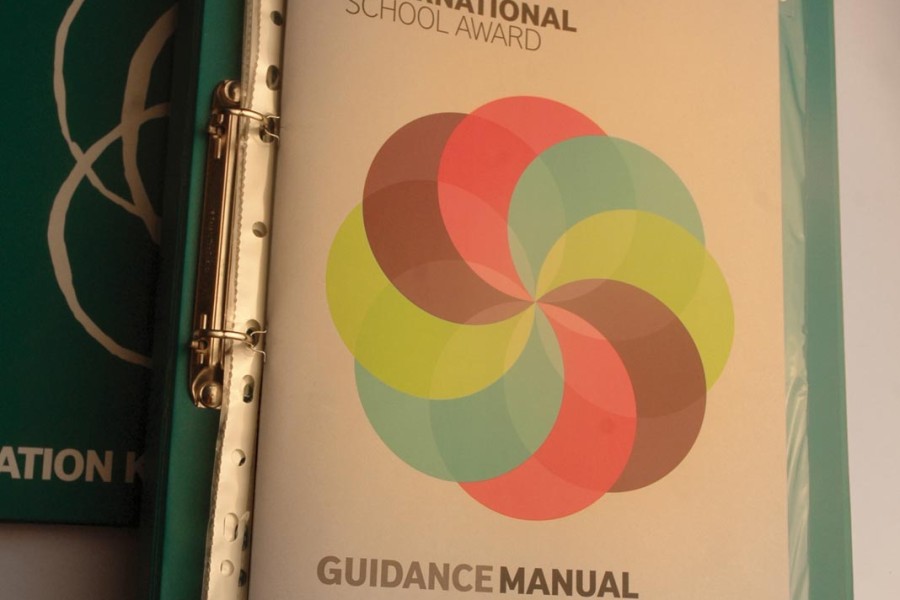
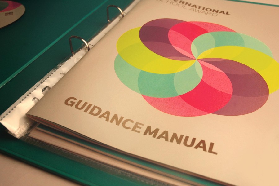
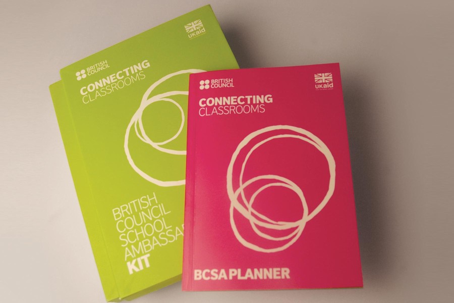
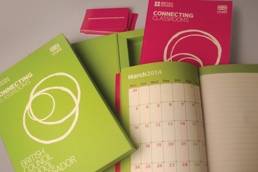
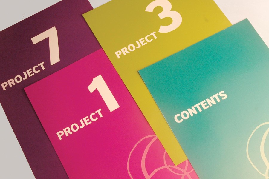
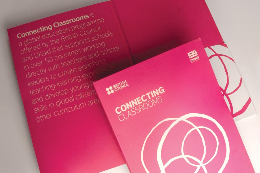
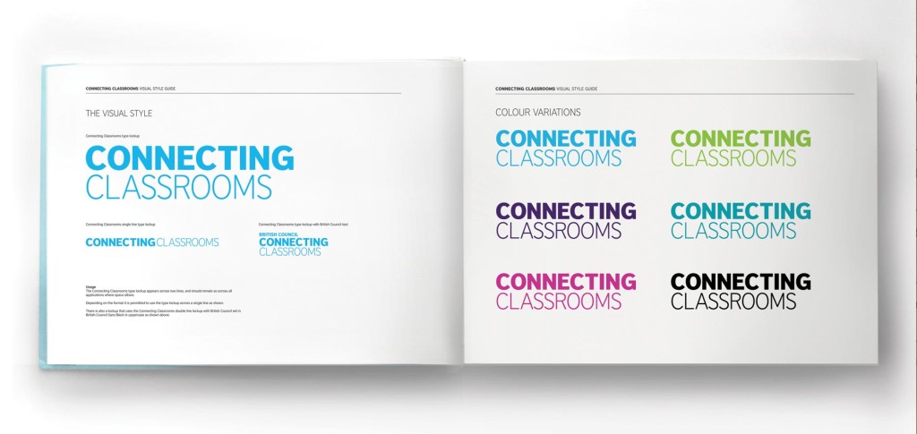
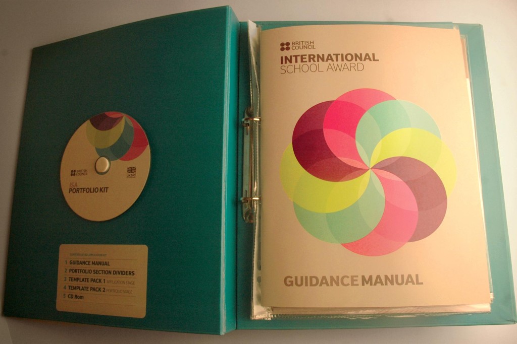
Branding and marketing material for the British Councils Connecting Classrooms global educational school programme. A graphic device of four different sized interlocking rings has been used for four different regions North, South, West, East as the main branding motif. These rings can be configured to form an endless amount of variations in patterns. Four stark bright colors have been chosen and the colors are carried throughout the various collaterals developed. The whole visual treatment is kept to a vectorized flat geometric style with importance to simplicity and legibility of information. The typeface used in British Council sans that lends a clear typographic communication to the brand.


