British Council
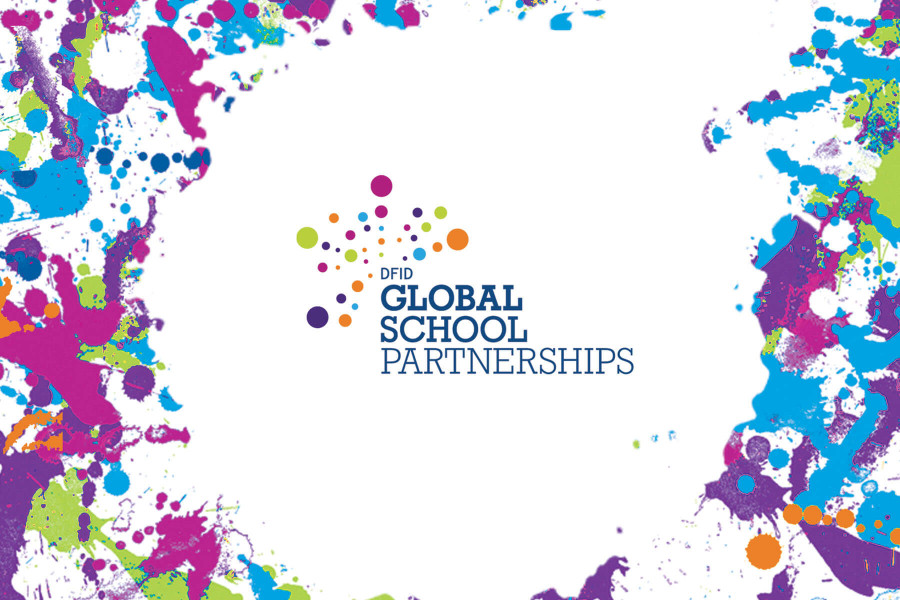
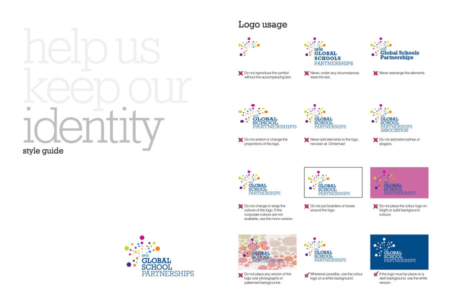
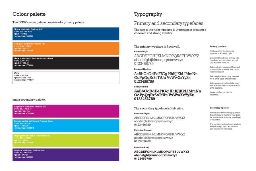
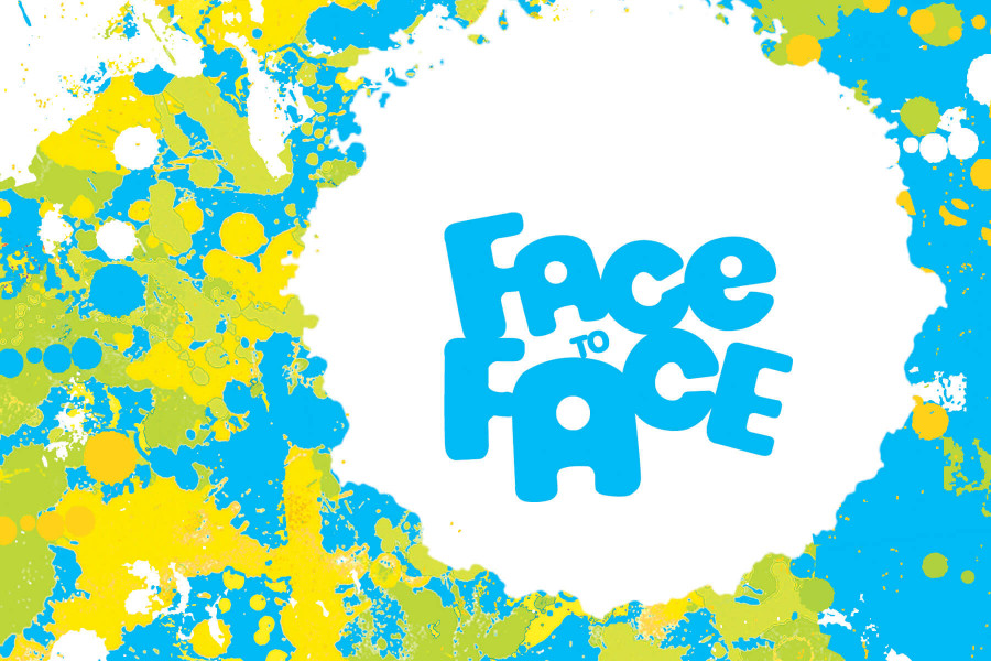
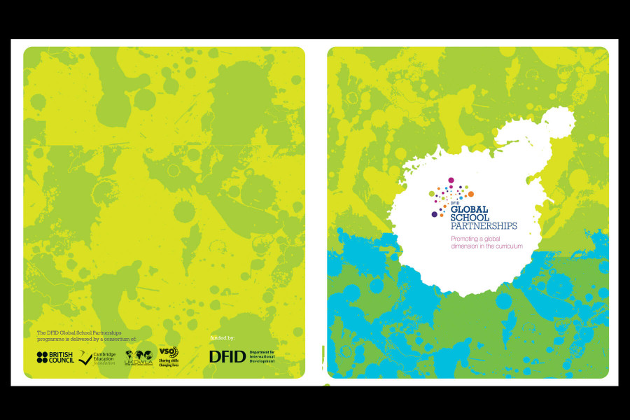
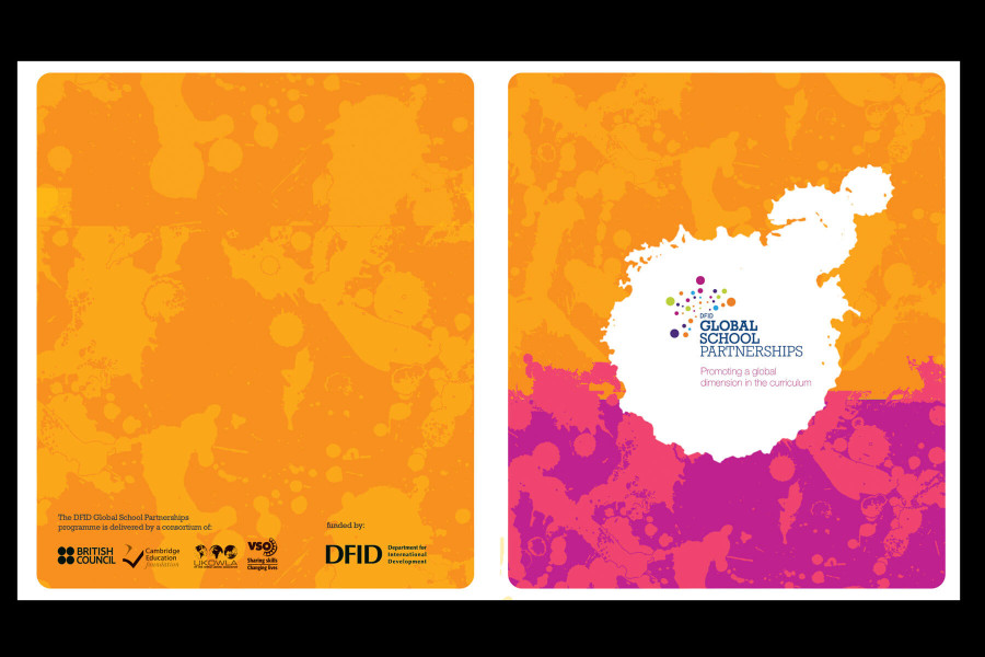
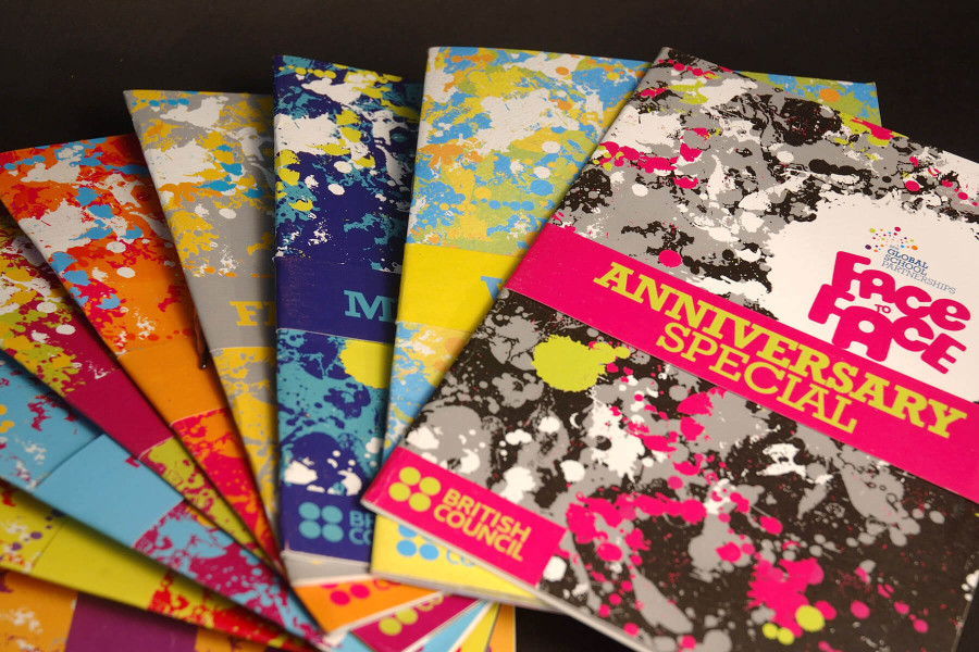
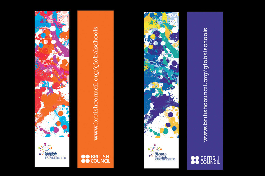
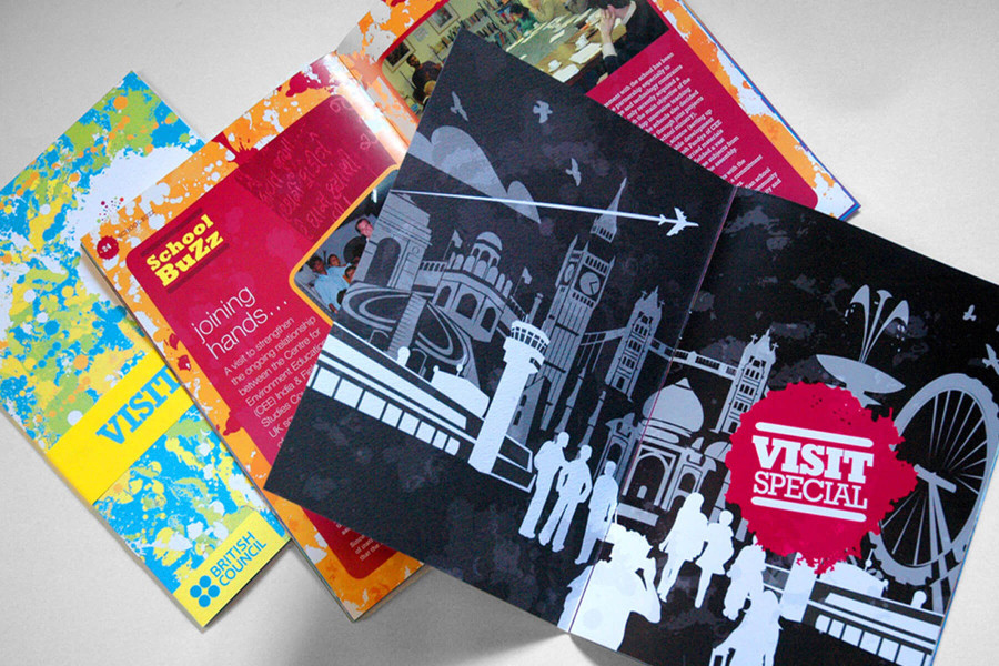
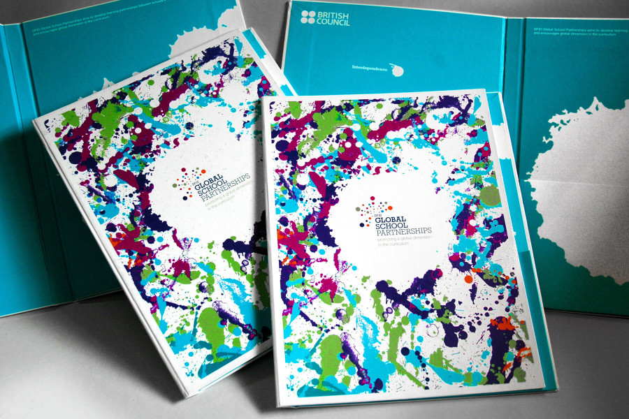
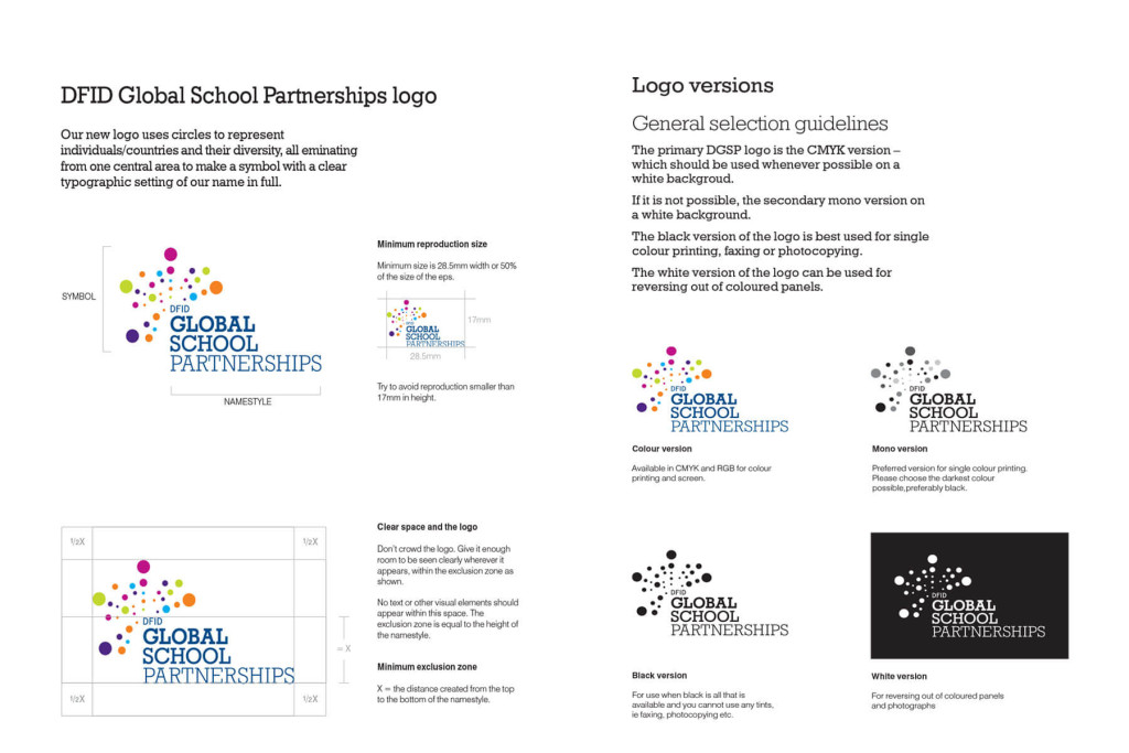
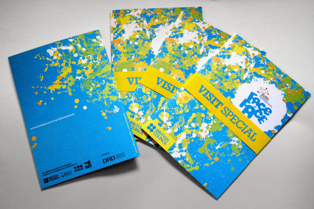
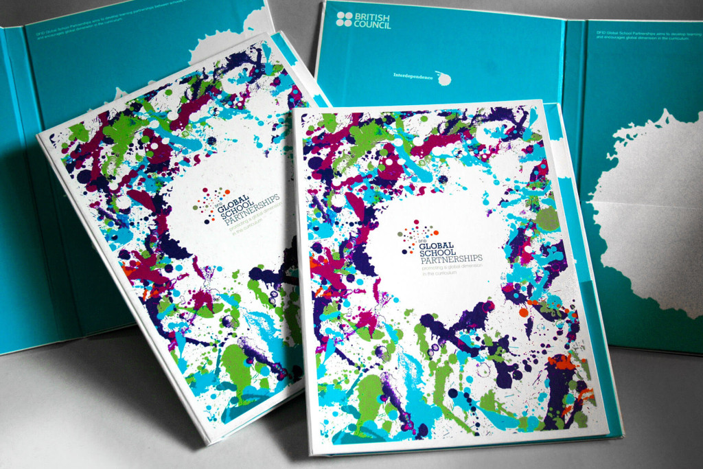
Branding programme for British Councils Global School Partnerships Programme. The design uses a radial splash of dots colors in different to represent the diversity of the childrens school. The dots have been used in painterly and more organic way in the various collateral designs. The design of the face to face magazine uses these dots with changing color schemes for each months issue. A comprehensive style guide documents the dos and donts of the visual identity and its usages. The typeface used is Rockwell light and Helvetica.

